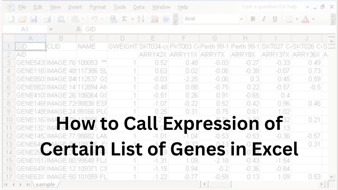
Introduction: How to Call Expression of Certain List of Genes in Excel
Gene expression analysis helps scientists understand how genes produce functional products like proteins or RNA. This analysis is crucial for studying normal cell functions and diseases.
Sometimes, researchers focus on a specific list of genes to see how they behave under certain conditions. This targeted approach can reveal important insights into biological processes.
Microsoft Excel is a common tool for managing and analyzing gene expression data. Its features allow users to organize data, perform basic statistical tests, and create simple visualizations. For example, Excel can help identify differentially expressed genes by calculating fold changes and performing statistical tests.
Using Excel to analyze the expression of a specific list of genes is practical for many researchers. It offers a straightforward way to handle data without the need for specialized software.
Sample Gene Expression Data Table
| Gene ID | Sample 1 Expression | Sample 2 Expression | Fold Change | P-Value |
|---|---|---|---|---|
| Gene A | 5.2 | 10.4 | 2.0 | 0.03 |
| Gene B | 7.8 | 7.8 | 1.0 | 0.85 |
| Gene C | 12.1 | 6.0 | 0.5 | 0.04 |
In this table, “Fold Change” shows how gene expression differs between two samples. A fold change greater than 1 indicates increased expression; less than 1 indicates decreased expression. The “P-Value” helps determine if the change is statistically significant.
Preparing Gene Expression Data in Excel
When learning how to call expression of certain list of genes in Excel, it’s important to prepare your data correctly. This involves three main steps: importing the data, organizing it properly, and ensuring its quality.
Importing Data into Excel
First, open Excel. Click on the “File” menu and select “Open.” Find your gene expression data file, which might be in formats like .csv or .txt. Select the file and click “Open.” Excel will display your data in a table format.
Structuring Data: Rows for Genes, Columns for Samples
Proper organization is key when learning how to call expression of certain list of genes in Excel. Each row should represent a gene, and each column should represent a sample. The first column can list gene names or IDs, and the first row can list sample names. This structure helps in analyzing and comparing gene expressions across different samples.
Ensuring Data Quality and Consistency
To ensure accurate analysis when learning how to call expression of certain list of genes in Excel, it’s important to check your data for errors. Look for missing values, duplicates, or outliers. Excel’s “Data” tab offers tools like “Remove Duplicates” and “Data Validation” to help clean your data. Consistent and clean data leads to more reliable results.
Sample Gene Expression Data Table
| Gene ID | Sample 1 Expression | Sample 2 Expression | Sample 3 Expression |
|---|---|---|---|
| Gene A | 5.2 | 4.8 | 5.5 |
| Gene B | 7.8 | 8.1 | 7.9 |
| Gene C | 12.1 | 11.8 | 12.3 |
In this table, each row represents a gene, and each column represents a sample. The numbers indicate the expression levels of each gene in the different samples.
By following these steps, you can effectively prepare your gene expression data in Excel, setting a solid foundation for further analysis.
Identifying Differentially Expressed Genes: How to Call Expression of Certain List of Genes in Excel
Identifying differentially expressed genes means finding which genes show significant changes between different conditions or treatments. This process helps scientists understand how genes respond to various factors. In this section, we’ll learn how to call expression of certain list of genes in Excel by calculating fold changes, performing t-tests, and adjusting for multiple comparisons.
Calculating Fold Changes Between Conditions
Fold change shows how much a gene’s expression level changes between two conditions. To calculate fold change in Excel:
- Organize Your Data: List genes in rows and conditions in columns.
- Calculate Fold Change: Divide the expression value in the treatment condition by the expression value in the control condition. Use this formula in Excel:Copy code
= Treatment_Value / Control_Value
If the result is greater than 1, it indicates an increase; if less than 1, it indicates a decrease. For example, if Gene A has an expression of 10 in the treatment and 5 in the control, the fold change is 2, meaning a twofold increase.
Performing Statistical Tests (e.g., t-tests) to Assess Significance
To determine if the changes in gene expression are statistically significant, we perform a t-test. In Excel, you can use the T.TEST function:
- Prepare Your Data: Ensure you have replicate expression values for each condition.
- Use the T.TEST Function: Apply the function in Excel:bashCopy code
=T.TEST(array1, array2, tails, type)- array1: Data range for the first condition.
- array2: Data range for the second condition.
- tails: Use 2 for a two-tailed test.
- type: Use 2 for a two-sample equal variance (homoscedastic) test.
This function returns a p-value indicating the significance of the difference. A p-value less than 0.05 typically suggests a significant difference.
Adjusting for Multiple Comparisons to Control False Discovery Rate
When testing multiple genes, there’s a higher chance of false positives. To address this, adjust the p-values to control the false discovery rate (FDR). A common method is the Benjamini-Hochberg procedure:
- Rank the p-values: Sort all p-values in ascending order.
- Apply the Formula: For each p-value, calculate the adjusted p-value using:cssCopy code
Adjusted_P = (p-value rank / total number of tests) * original p-value - Compare to FDR Threshold: Determine a threshold (e.g., 0.05) and identify genes with adjusted p-values below this threshold as significant.
This adjustment helps reduce the likelihood of false positives when analyzing multiple genes.
Sample Data Table
| Gene ID | Control Expression | Treatment Expression | Fold Change | p-value | Adjusted p-value |
|---|---|---|---|---|---|
| Gene A | 5.0 | 10.0 | 2.0 | 0.04 | 0.06 |
| Gene B | 8.0 | 8.5 | 1.06 | 0.20 | 0.25 |
| Gene C | 12.0 | 6.0 | 0.5 | 0.01 | 0.03 |
In this table, “Fold Change” shows the ratio between treatment and control expressions. The “p-value” indicates the significance of the change, and the “Adjusted p-value” accounts for multiple comparisons.
By following these steps, you can effectively call expression of certain list of genes in Excel, identifying which genes are differentially expressed between conditions.
Visualizing Gene Expression Data: An Idiom About Regret NYT
Visualizing gene expression data helps us understand complex information easily. In this section, we’ll learn how to create histograms of p-values, generate volcano plots, and use Excel’s charting tools for data visualization.
Creating Histograms of P-Values to Assess Distribution
A histogram shows how often different p-values appear in your data. This helps you see the overall pattern of your results.
To create a histogram in Excel:
- Prepare Your Data: List your p-values in a single column.
- Select the Data: Highlight the p-values you’ve listed.
- Insert Histogram:
- Go to the “Insert” tab.
- Click on “Insert Statistic Chart.”
- Choose “Histogram.”
Excel will create a histogram showing the distribution of your p-values.
Sample Data Table for Histogram
| P-Value |
|---|
| 0.01 |
| 0.05 |
| 0.20 |
| 0.03 |
| 0.15 |
In this table, each row represents a p-value from your analysis.
Generating Volcano Plots to Display Significance vs. Fold Change
A volcano plot shows both the significance and the size of changes in gene expression. It’s a helpful way to find important genes.
To create a volcano plot in Excel:
- Prepare Your Data: Have columns for gene names, fold changes, and p-values.
- Calculate -Log10(P-Value): In a new column, calculate the negative logarithm (base 10) of each p-value.
- Insert Scatter Plot:
- Select the fold change and -Log10(p-value) columns.
- Go to the “Insert” tab.
- Choose “Scatter” and select “Scatter with only Markers.”
This will create a volcano plot, with fold change on the x-axis and significance on the y-axis.
Sample Data Table for Volcano Plot
| Gene | Fold Change | P-Value | -Log10(P-Value) |
|---|---|---|---|
| Gene A | 2.0 | 0.01 | 2.00 |
| Gene B | 0.5 | 0.05 | 1.30 |
| Gene C | 1.5 | 0.20 | 0.70 |
In this table, each row represents a gene with its fold change, p-value, and calculated -Log10(p-value).
Utilizing Excel’s Charting Tools for Data Visualization
Excel offers various tools to make your data visualizations clear and informative:
- Customize Axes: Label your axes clearly and set appropriate scales.
- Add Titles and Labels: Provide descriptive titles and labels to explain your charts.
- Use Colors and Shapes: Differentiate data points using colors and shapes to highlight important information.
Advanced Analysis Using Excel Add-ins: How to Call Expression of Certain List of Genes in Excel
Analyzing gene expression data can be complex, but with the right tools, it becomes manageable. In this section, we’ll explore how to use Excel add-ins, specifically XLSTAT, to perform advanced analyses like differential expression.
Introduction to XLSTAT for Differential Expression Analysis
XLSTAT is an add-in for Excel that enhances its statistical capabilities, making it suitable for complex analyses like differential expression. It allows you to perform various statistical tests directly within Excel, streamlining your data analysis process.
Performing Parametric and Non-Parametric Tests
Differential expression analysis often involves comparing gene expression levels between different conditions. XLSTAT offers both parametric and non-parametric tests to suit different data types:
- Parametric Tests: These tests assume that the data follows a specific distribution (usually normal). They are more powerful when the data meets these assumptions.
- Non-Parametric Tests: These tests do not assume a specific data distribution and are useful when data doesn’t meet parametric assumptions.
In XLSTAT, you can choose the appropriate test based on your data’s characteristics. For example, if your data is normally distributed, you might use a t-test. If it’s not, a non-parametric test like the Mann-Whitney U test would be more appropriate.
Interpreting Results from XLSTAT Outputs
After performing the analysis, XLSTAT provides outputs that help you understand your data:
- P-Values: Indicate the probability that the observed differences are due to chance. A smaller p-value suggests a more significant difference.
- Fold Changes: Show how much the expression of a gene has increased or decreased between conditions.
- Charts and Plots: Visual representations like histograms and volcano plots help in understanding the distribution and significance of gene expression changes.
By carefully examining these outputs, you can identify genes that are differentially expressed and may be of biological significance.
Sample Data Table for Differential Expression Analysis
| Gene | Condition 1 Expression | Condition 2 Expression | Fold Change | P-Value |
|---|---|---|---|---|
| Gene A | 10.0 | 20.0 | 2.0 | 0.01 |
| Gene B | 5.0 | 5.5 | 1.1 | 0.15 |
| Gene C | 8.0 | 4.0 | 0.5 | 0.03 |
In this table, Gene A shows a significant increase in expression (fold change of 2.0 and p-value of 0.01), while Gene B shows a slight increase (fold change of 1.1 and p-value of 0.15), and Gene C shows a significant decrease (fold change of 0.5 and p-value of 0.03).
Post-Analysis Data Interpretation: How to Call Expression of Certain List of Genes in Excel
After analyzing gene expression data, it’s important to interpret the results correctly. This involves filtering and sorting data to find significant genes, annotating them with biological information, and exploring pathways and gene ontology terms associated with these genes.
Filtering and Sorting Data to Identify Significant Genes
To focus on genes that show meaningful changes, filter and sort your data based on criteria like fold change and p-value. In Excel, you can use the “Filter” feature to display only genes that meet your specific conditions. For example, you might filter for genes with a fold change greater than 2 and a p-value less than 0.05. This helps in identifying genes that are significantly differentially expressed.
Annotating Genes with Biological Information
Once you’ve identified significant genes, it’s useful to add biological information to understand their roles better. This can include gene names, functions, and associated pathways. You can use online databases like GeneCards or Ensembl to find this information. Adding these details in Excel can help you interpret the biological significance of your findings.
Exploring Pathways and Gene Ontology Terms Associated with Significant Genes
To gain deeper insights, explore the pathways and gene ontology (GO) terms related to your significant genes. Tools like DAVID or Enrichr can help you perform functional enrichment analysis. These tools identify biological processes, pathways, and molecular functions that are over-represented in your list of significant genes. Understanding these associations can provide context to your findings and suggest potential biological implications.
Sample Data Table
Here’s an example of how your data might look after filtering and annotating:
| Gene | Fold Change | P-Value | Gene Name | Function | Pathway |
|---|---|---|---|---|---|
| Gene A | 3.2 | 0.01 | ABC1 | Transport | Metabolism |
| Gene B | 0.5 | 0.03 | DEF2 | Enzyme Activity | Signal Trans. |
| Gene C | 2.8 | 0.02 | GHI3 | Receptor | Immune Response |
In this table, after filtering for significant genes, we’ve added columns for gene names, functions, and associated pathways to provide a comprehensive view of the data.
Best Practices and Considerations: How to Call Expression of Certain List of Genes in Excel
When analyzing gene expression data in Excel, it’s essential to follow best practices to ensure accurate and meaningful results. This includes proper data normalization, understanding Excel’s limitations with large datasets, and considering specialized software for complex analyses.
Ensuring Data Normalization and Transformation
Normalization adjusts data to account for technical variations, making it possible to compare gene expression levels accurately. Common methods include:
- Log Transformation: Applying a logarithmic scale to data can stabilize variance and make patterns more apparent.
- Z-Score Transformation: Standardizing data by subtracting the mean and dividing by the standard deviation to compare gene expression across samples.
In Excel, you can perform these transformations using built-in functions. For example, to log-transform data, use the =LOG10(cell_reference) function. Ensure that all data points are positive before applying log transformation.
Understanding Limitations of Excel for Large-Scale Data Analysis
While Excel is a powerful tool, it has limitations when handling large datasets:
- Data Size: Excel has a maximum of 1,048,576 rows and 16,384 columns. Datasets exceeding this size may not be fully accommodated.
- Performance: Large datasets can cause Excel to slow down or crash, especially when performing complex calculations.
- Statistical Analysis: Excel lacks advanced statistical functions required for comprehensive gene expression analysis.
For large-scale data analysis, consider using specialized software like R or Python, which are designed to handle extensive datasets and offer advanced statistical capabilities.
Considering Alternative Specialized Software for Complex Analyses
For more complex analyses, specialized software provides advanced features:
- R: A free software environment for statistical computing and graphics, widely used in bioinformatics for gene expression analysis.
- Python: A programming language with libraries like Pandas and SciPy, suitable for data manipulation and statistical analysis.
- XLSTAT: An Excel add-in that enhances Excel’s statistical capabilities, including tools for differential expression analysis.
These tools offer more robust solutions for complex analyses and can handle larger datasets more efficiently than Excel.
Sample Data Table
Here’s an example of how your data might look after normalization:
| Gene | Raw Expression | Log-Transformed Expression | Z-Score Transformed Expression |
|---|---|---|---|
| Gene A | 100 | 2 | 1.5 |
| Gene B | 200 | 2.3010 | 0.5 |
| Gene C | 50 | 1.69897 | -0.5 |
In this table, ‘Raw Expression’ represents the original data, ‘Log-Transformed Expression’ shows the data after applying a log transformation, and ‘Z-Score Transformed Expression’ displays the standardized data.
Conclusion: How to Call Expression of Certain List of Genes in Excel
Analyzing gene expression data in Excel involves several key steps:
- Preparing Gene Expression Data: Import your data into Excel, structure it with genes in rows and samples in columns, and ensure data quality and consistency.
- Identifying Differentially Expressed Genes: Calculate fold changes between conditions, perform statistical tests like t-tests to assess significance, and adjust for multiple comparisons to control the false discovery rate.
- Visualizing Gene Expression Data: Create histograms of p-values to assess distribution, generate volcano plots to display significance versus fold change, and utilize Excel’s charting tools for data visualization.
- Advanced Analysis Using Excel Add-ins: Use tools like XLSTAT for differential expression analysis, perform parametric and non-parametric tests, and interpret results from XLSTAT outputs.
- Post-Analysis Data Interpretation: Filter and sort data to identify significant genes, annotate genes with biological information, and explore pathways and gene ontology terms associated with significant genes.